
How AI Can Help Your Business Grow
Read Full Article
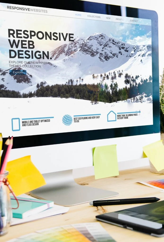
Mobile-First, User-Centered Web Design
At NextWebi, we design responsive websites that automatically adapt to different screen sizes, devices, and browsing environments. Our goal is to ensure that every visitor receives a consistent and intuitive experience, whether they are accessing your website from a desktop, tablet, or mobile phone. By focusing on responsive layouts and flexible design structures, we help businesses reach users without limitations.
Our responsive web design process follows a mobile-first approach, allowing us to prioritize usability and performance from the smallest screens upward. We carefully design navigation, content placement, and interactions to ensure clarity and ease of use. This approach improves accessibility, enhances user engagement, and supports better conversion rates across devices.
We also place strong emphasis on performance and page speed, ensuring that responsive designs remain lightweight and efficient. Clean code, optimized images, and structured layouts help deliver faster load times and smoother interactions. This not only improves user experience but also supports search engine visibility and long-term website performance.
By combining modern UI design, usability best practices, and scalable frameworks, we create responsive websites that are easy to manage and future-ready. Our solutions are built to evolve with changing technologies and user behaviors, helping businesses maintain a strong and consistent digital presence over time.

Our responsive web design services focus on creating websites that adapt seamlessly across all devices and screen sizes. At NextWebi, we combine modern design principles with usability and performance best practices to deliver responsive websites that enhance user experience, improve engagement, and support business growth.
From new website design to redesign and optimization, our services cover every aspect of responsive web design. We work closely with businesses to understand their goals, users, and brand identity, ensuring each responsive website is visually appealing, functional, and easy to maintain.
We design custom responsive websites tailored to your brand and business requirements. Each layout is built to adapt smoothly across devices while maintaining design consistency and usability.
Our mobile-first approach ensures websites are optimized for smaller screens first, improving navigation, readability, and performance on mobile devices.
We focus on intuitive layouts, clear navigation, and engaging visual elements. Our UI/UX designs enhance usability and create meaningful user interactions across devices.
We help transform existing websites into fully responsive experiences. Our redesign services improve layout flexibility, performance, and overall user experience.
Our responsive designs are optimized for fast loading times using clean code, optimized images, and efficient layouts to ensure smooth performance.
We ensure responsive websites work consistently across all major browsers and devices, delivering a reliable experience to every user.

At NextWebi, we focus on creating responsive websites that balance design, usability, and performance. Our team understands that a responsive website is not just about fitting different screen sizes—it’s about delivering a consistent and meaningful user experience across all devices. We approach every project with a clear understanding of business goals, user behavior, and brand identity.
Our responsive web design process combines mobile-first thinking, modern UI principles, and performance optimization. We pay close attention to layout flexibility, navigation flow, page speed, and cross-browser compatibility to ensure reliable results. With transparent communication, collaborative workflows, and long-term support, we help businesses build responsive websites that are easy to manage, future-ready, and built to grow with evolving digital needs.
Years in Business
Projects Delivered
Client Relationships


Our responsive web design services support businesses across a wide range of industries. We understand that every industry has unique users, goals, and digital challenges. Our designs are tailored to meet specific industry requirements while ensuring usability, performance, and consistency across devices. This allows businesses to deliver seamless user experiences and grow their digital presence.
Our responsive web designs for e-commerce focus on smooth navigation and product discovery. We ensure consistent shopping experiences across mobile and desktop devices. Performance optimization improves page speed and conversions. This helps businesses drive sales and retain customers.
We build responsive websites for healthcare and wellness platforms with a focus on usability and accessibility. Designs support patient engagement, information clarity, and device compatibility. Performance and responsiveness ensure reliable user experiences. This helps build trust and accessibility.
Our responsive designs for finance and fintech businesses emphasize clarity and secure user interactions. We ensure layouts adapt smoothly across devices for dashboards and data-driven platforms. Performance and usability are prioritized. This supports consistent and reliable digital experiences.
We design responsive websites for education and eLearning platforms that support interactive learning experiences. Layouts are optimized for accessibility and readability across devices. Responsive design ensures seamless access to content. This enhances learner engagement.
Our responsive web design solutions support enterprise websites and corporate platforms. We focus on scalability, brand consistency, and usability across devices. Clean layouts and flexible structures allow easy updates. This ensures long-term maintainability.
We design responsive websites for logistics and transportation businesses requiring real-time information access. Our layouts support dashboards, tracking interfaces, and operational visibility. Performance optimization ensures smooth interactions. This helps streamline communication.
We create responsive designs for media and marketing platforms with content-rich layouts. Our designs focus on engagement, visual clarity, and device adaptability. Performance remains a key priority. This ensures consistent brand experiences across channels.
Our responsive web design process is focused on creating flexible, user-friendly websites that perform consistently across all devices. We follow a structured yet adaptable approach to ensure every stage—from planning to launch—is aligned with usability, performance, and business goals.
We begin by understanding your brand, target audience, and design expectations. This helps us plan layouts, content structure, and user journeys that work seamlessly across screen sizes. During the design and development phase, we apply mobile-first principles, modern UI patterns, and responsive frameworks to ensure smooth functionality and visual consistency.
Learn MoreWe begin by understanding your business goals, target audience, and brand identity. This helps us define design expectations and functional requirements. We analyze user behavior and device usage to plan an effective responsive strategy. This stage ensures clarity before design begins.
Our team creates wireframes and layout structures that adapt seamlessly across devices. We plan content hierarchy, navigation flow, and responsive breakpoints. This ensures consistency and usability on all screen sizes. Early planning helps avoid design issues later.
We design visually engaging and responsive interfaces using modern UI principles. Our designs focus on clarity, accessibility, and brand consistency. Every element is optimized to adjust smoothly across devices. This creates a cohesive and user-friendly experience.
During development, we apply mobile-first techniques and responsive frameworks. Clean code, flexible grids, and optimized assets ensure fast loading and smooth interactions. Performance and scalability remain a priority throughout development.
We test the website across multiple devices, screen resolutions, and browsers. This helps identify layout, performance, or compatibility issues. Necessary refinements are made to ensure consistency. Testing ensures a reliable and polished final output.
Once approved, the website is deployed in a live environment. We monitor performance and address any post-launch refinements. Ongoing support ensures your responsive website stays updated and effective. This helps maintain long-term usability and performance.
This section answers common questions about responsive web design, its benefits, and how it improves usability across devices. It helps you understand our approach, process, and how responsive design supports better user experience and performance.
Responsive web design ensures that a website adapts smoothly to different screen sizes and devices, including desktops, tablets, and mobile phones. It provides a consistent user experience across all platforms.
A responsive website improves usability, engagement, and accessibility for users. It also helps businesses reach mobile users, reduce bounce rates, and support better search engine visibility.
Yes, responsive websites are designed to function consistently across major browsers and devices. We test designs thoroughly to ensure compatibility and smooth performance.
Yes, we can transform existing websites into fully responsive designs. This includes improving layout flexibility, navigation, and overall user experience.
When done correctly, responsive design improves performance. We optimize layouts, images, and code to ensure fast loading times across devices.
Yes, responsive web design supports SEO by providing a single, mobile-friendly website. This improves user experience and helps search engines crawl and rank your site effectively.
Our client testimonials reflect the quality, consistency, and user-focused approach we bring to responsive web design projects. We work closely with businesses to deliver websites that look great, perform well, and provide seamless experiences across all devices.
Here is the tech stack used by our team while offering IT development services:
 AI
AI
 Frontend
 Backend
 Cloud
Cloud
 Database
Explore our featured content on different industries that you may find helpful.
Creativity is our heartbeat. We constantly challange ourselves to further our technical prowess and help our customers to deliver execeptional customer experience.


 +91 7619635111
 +971 568467827